Packaging Trends: What’s Your Visual Story?
By: Andrea Serie
As you browse the aisles in the grocery store, what inspires you to try a new product? A recommendation from a friend? An email promotion? Or does the packaging call to you?
Packaging is meant to lure a particular buyer based on its visual story. Is the product steeped in tradition and targeting a sophisticated buyer? Or is it a cutting-edge product aimed at Generation Z? Age, socio-economic background, purchase motivator and price point all affect the style of the packaging.
The package evokes the first direct impression a consumer has with a product. The aesthetic sparks an interest to take the next step to purchase. If the package appearance has a lot of personality, it will even influence the buyer to share a post on social about their new buy. The goals of marketers, purchase and publicity, remain consistent. However, the packaging trends to attain those objectives shift, with a few traditional methods that have lasted throughout the years. Below is a roundup of design trends that casted a strong influence in recent months.
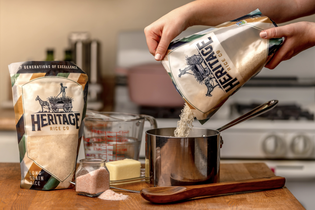
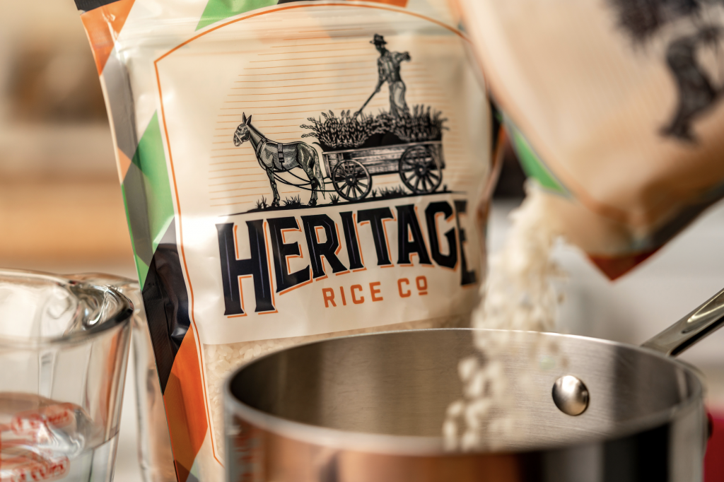
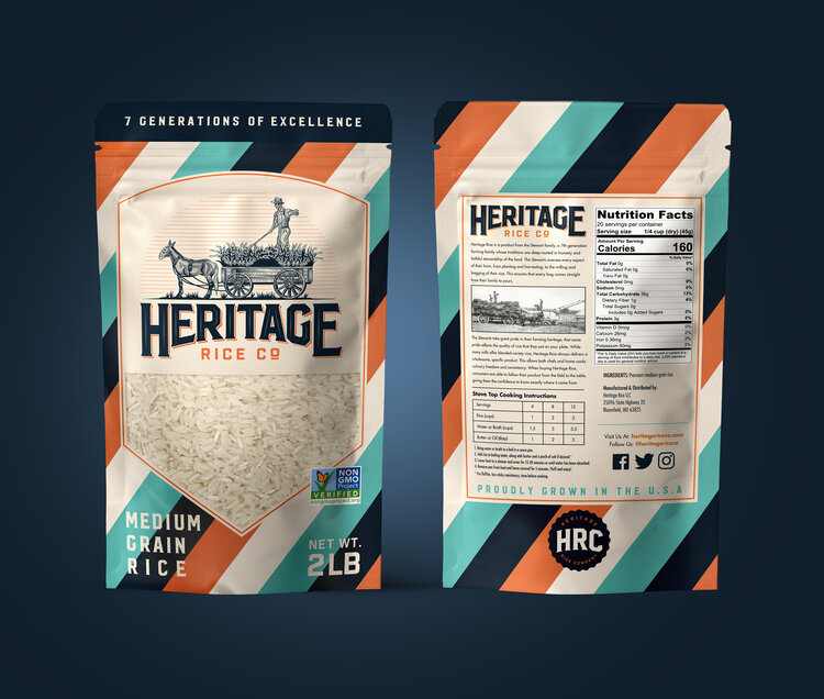
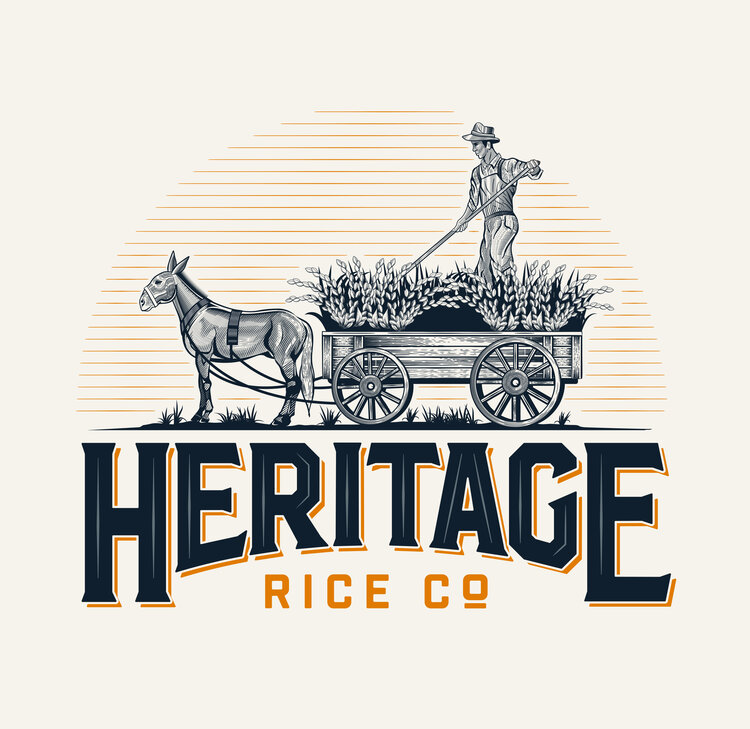
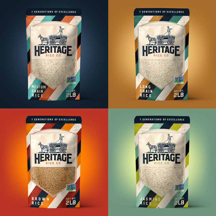
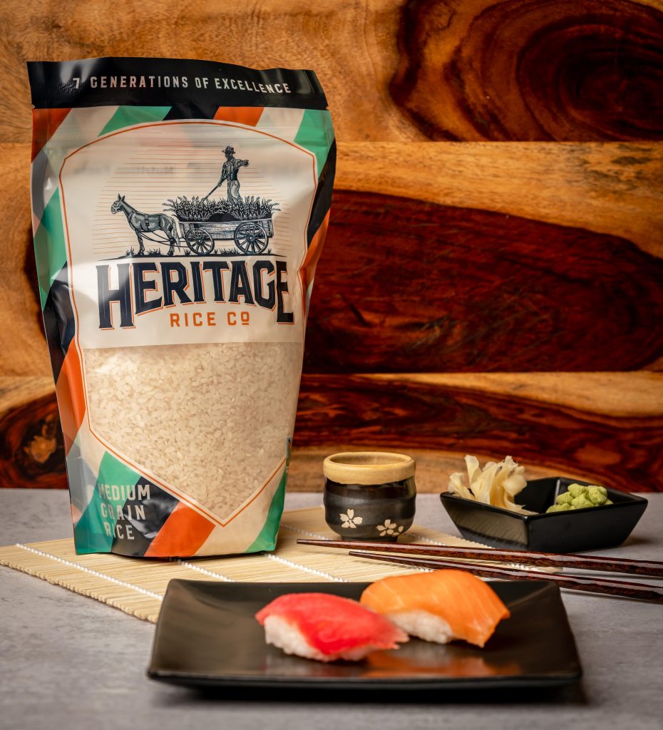
Heritage Rice Co
- Logo
- Branding guidelines
- Packaging
- Website
- Social media
The Stewart family, 7th generation rice farmers from Missouri, traditionally sold their rice to mills. However, the Stewarts wanted to broaden their reach to grocery stores and restaurants throughout the USA. With a focus of connecting a modern buyer to a company dating back over 100 years, our east coast designer and west coast project manager, told the story of their middle American family with an artisanal feel reflective of the history of their product. Earth tones, traditional typography and an illustration inspired by a family photo were the elements of an inviting rice package representing their farm to table product. The packaging has an aura of stepping back in time with the image presenting like a hand-drawn sketch. The consumer has an emotional reaction to the package when it arouses thoughts of a simpler time. “Working with Double Down Digital has been an amazing experience,” said Brandon Stewart, Managing Member, Heritage Rice. “With their collaboration, the dream for our brand became a reality.” Check them out on hive.com
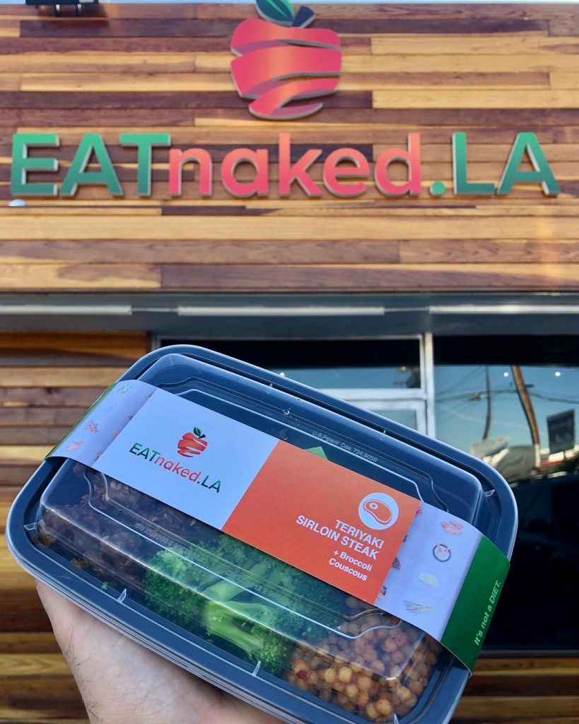
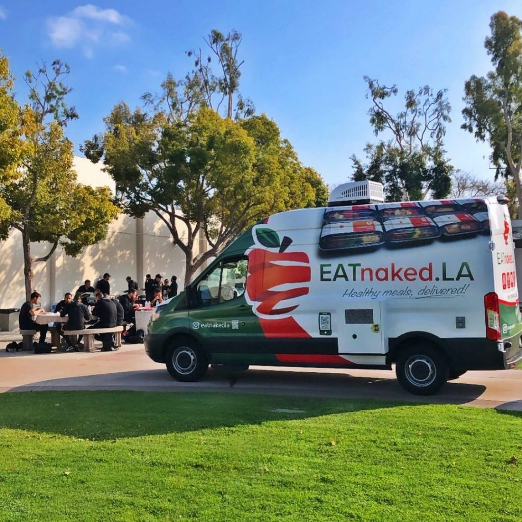
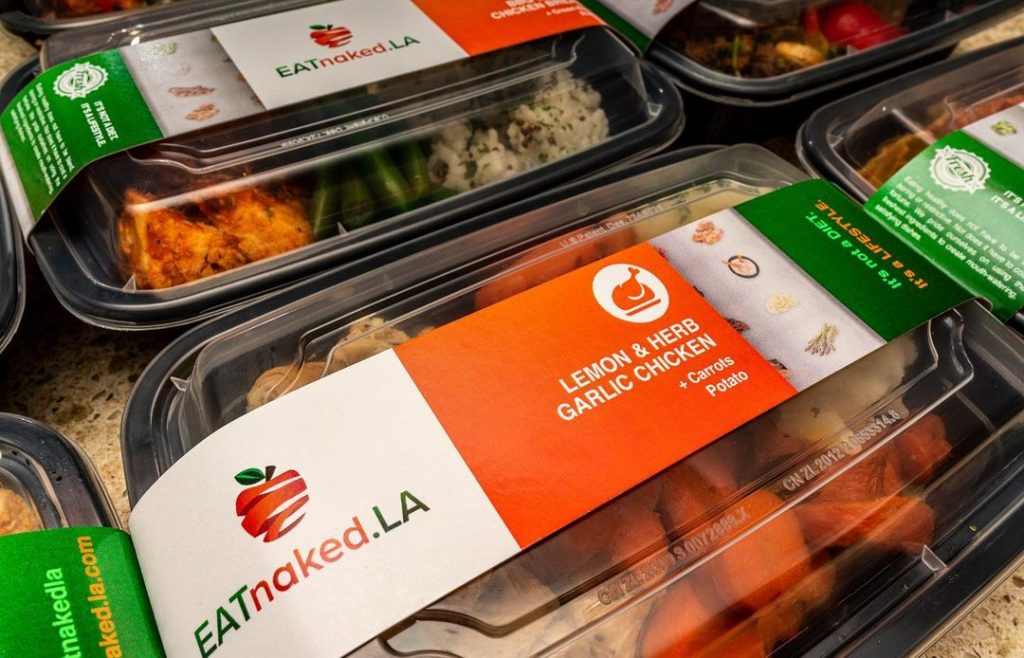
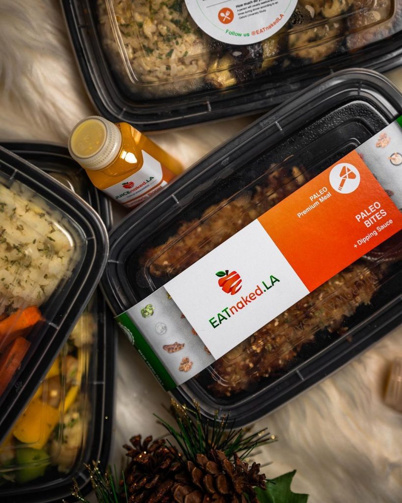
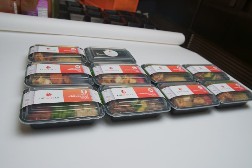
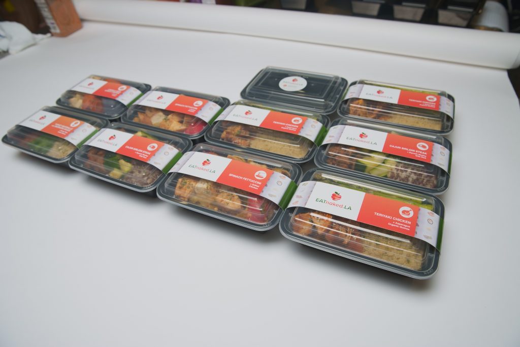
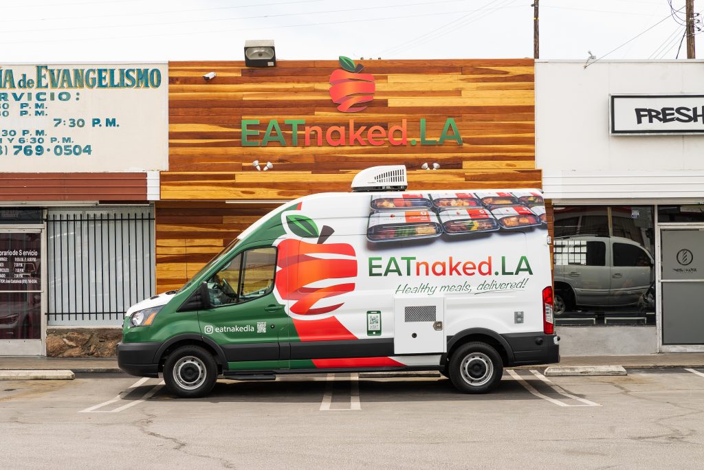
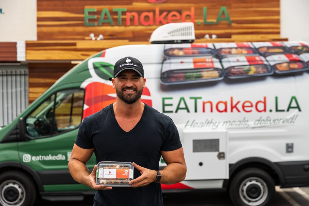
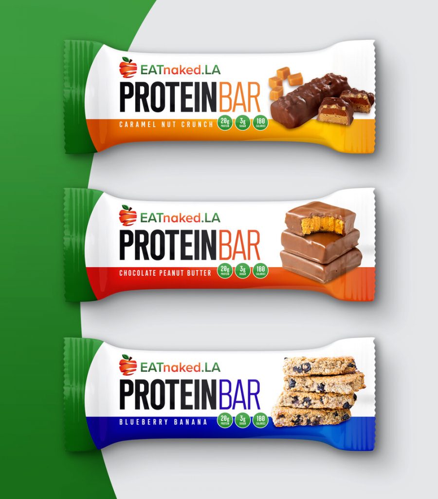
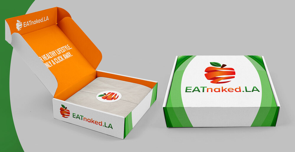
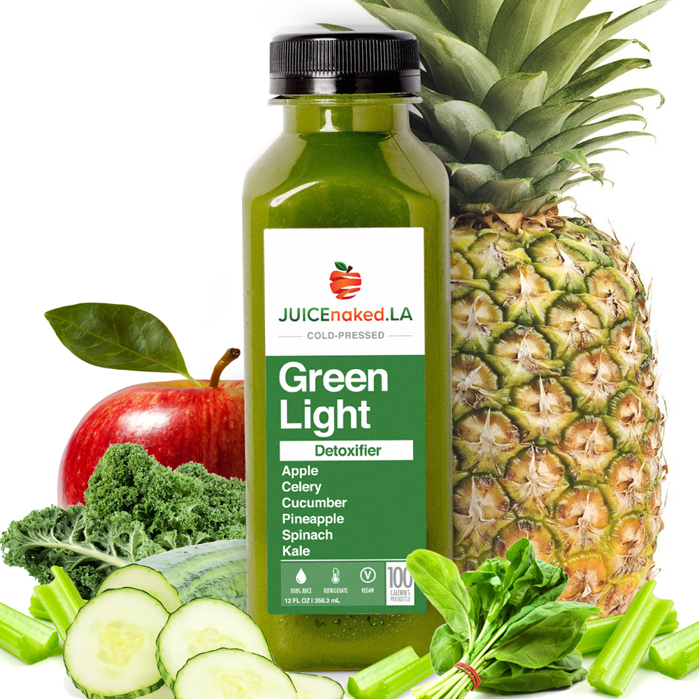
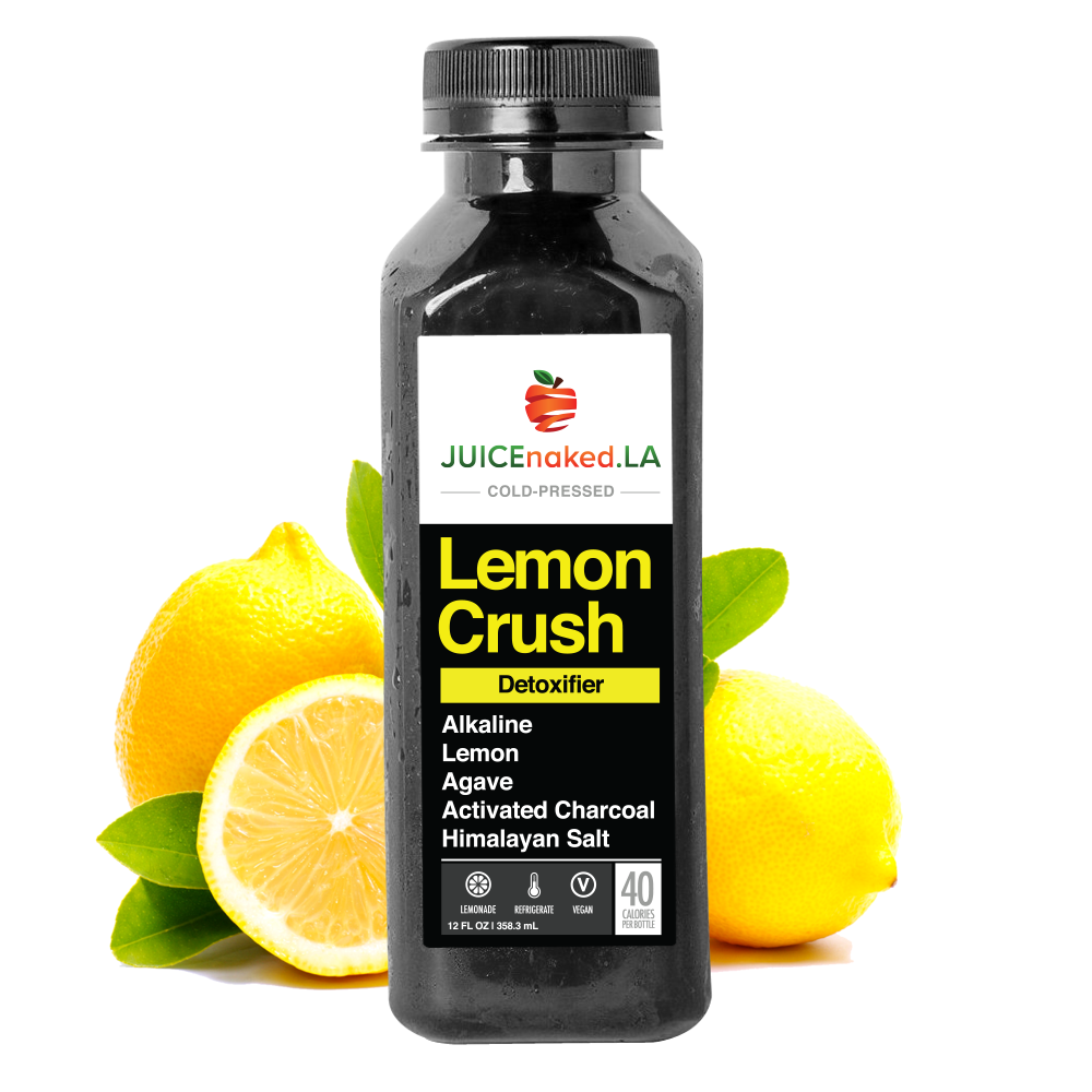
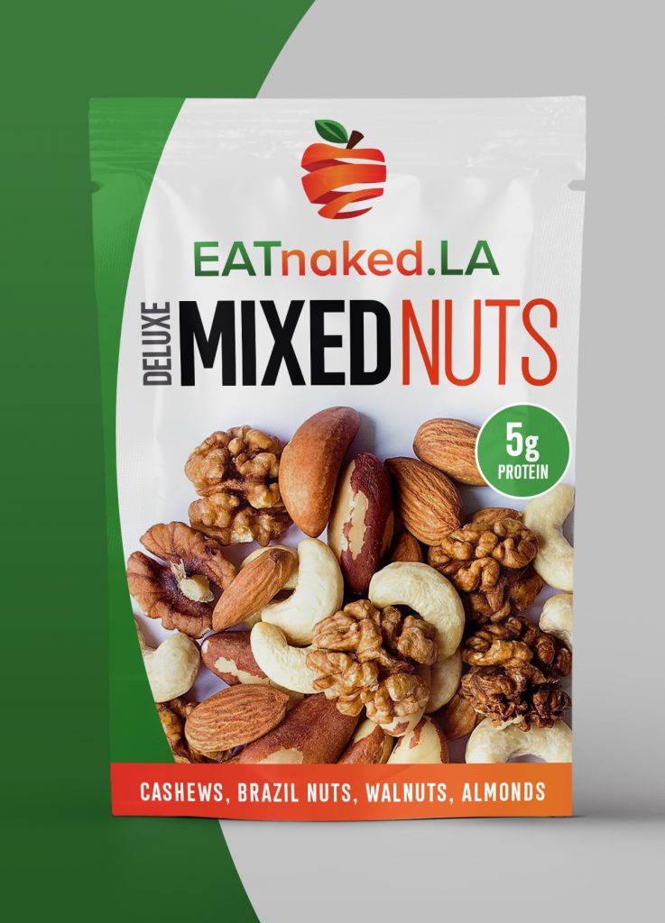
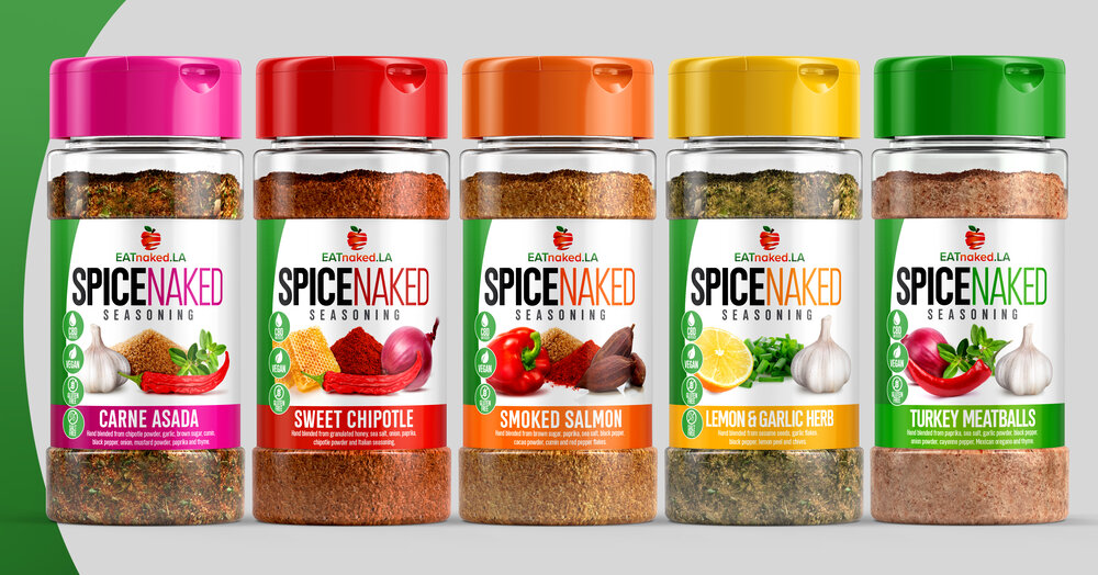
EATnaked.LA
- Logo
- Packaging
- Website
- Van wrap
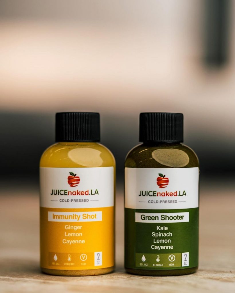
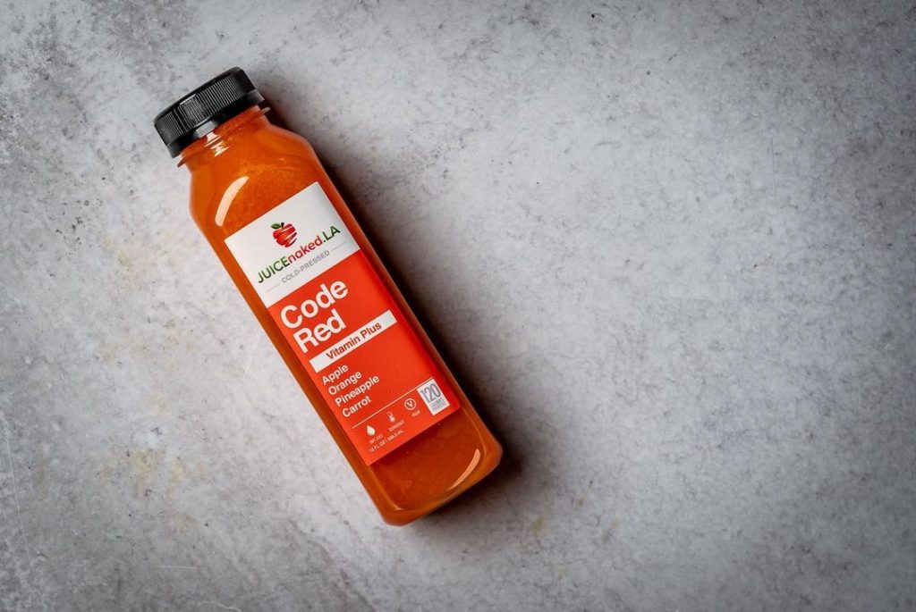
EATnaked.LA is a meal prep delivery service based in LA. We first joined forces six years ago to execute a rebranding campaign, including logo development, food/juice packaging, web design and delivery van wrap. The new brand assets communicate healthy messaging clearly with a fresh approach. Our target audience is focused on exercise and making healthy decisions in their life. Thus the “naked apple” logo conveys a sense of change, movement, and spontaneity. The graphic is modern and clean. The revamped food packaging has clear lids so buyers can see the actual meal. The labels list each main dish and sides included to make the purchase process easier and faster. The updated juice labels prominently feature the ingredients and calories to educate and inform buyers. The labels are set in white, appearing lighter and move inviting. The updated design is crisp and eye-catching. The website design showcases various subscription menu options, allowing clients to build their meal plans to their exact specifications. The subscription model creates opportunity for monthly repeat clients with minimal marketing effort. Since the majority (80%) of customers orders are on mobile devices, the redesign had an emphasis on the mobile experience, while maintaining a consistent workflow between desktop, tablet and mobile devices. The result was a 54% increase in revenue and 231% increase in new customer acquisition. “Adam and his team truly captured the essence of the EATnaked.LA brand,” said Fernando Restrepo, Founder of EATnaked.LA. “Their work is fresh and inviting, which is exactly what we strive to be as a company. Double Down delivered.” For your next week’s meals, visit EATnaked.LA.
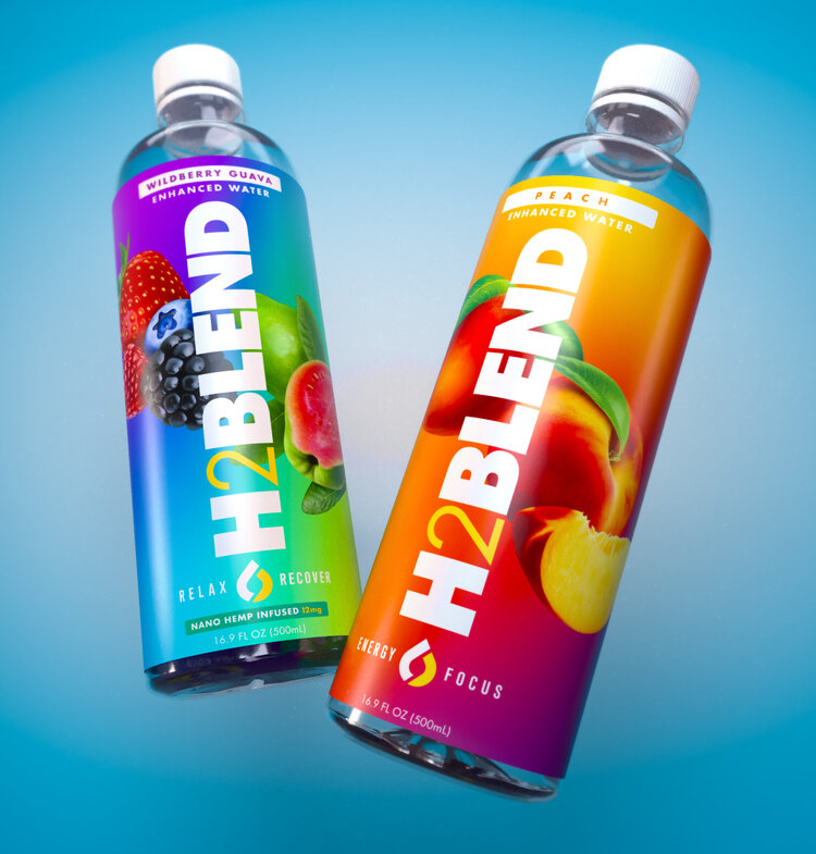
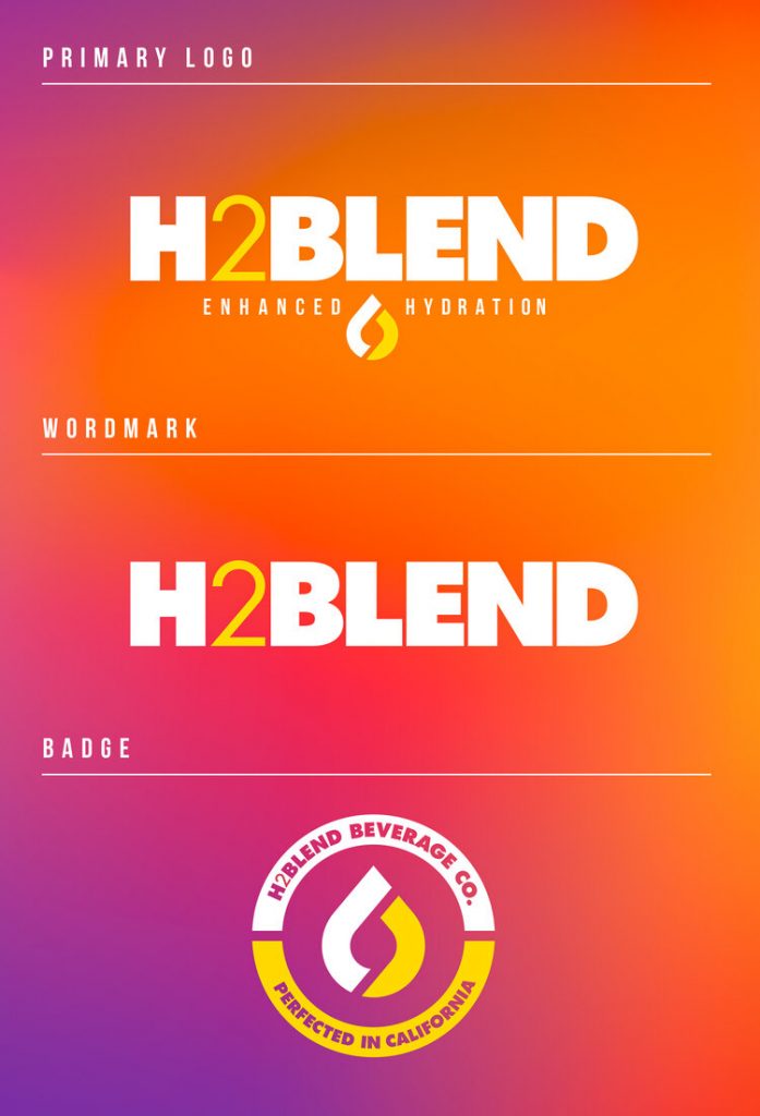
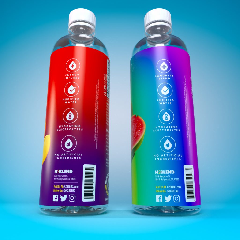
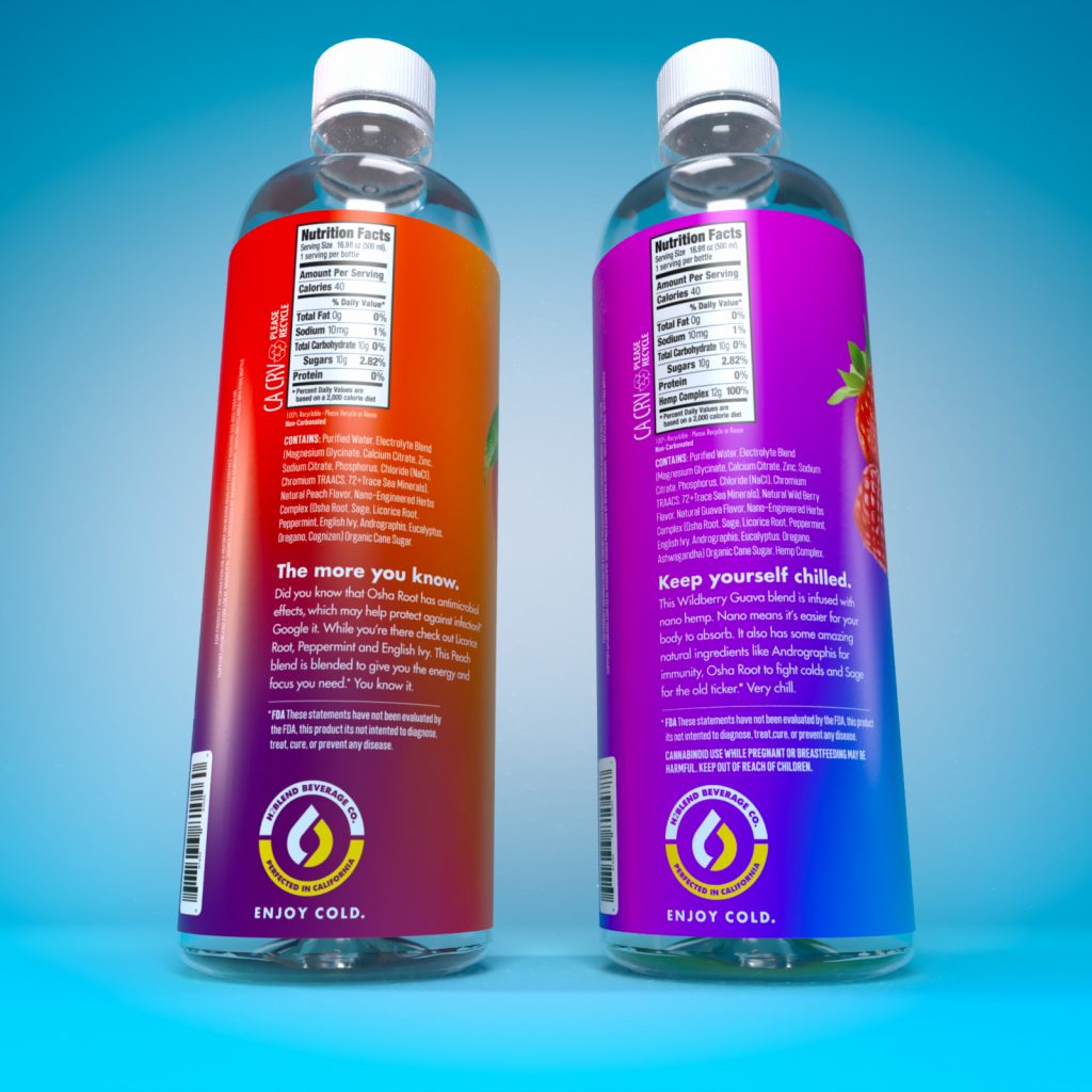
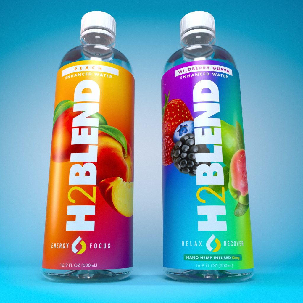
H2Blend
- Logo
- Packaging
- Website
When EATnakedLA founder, Fernando Restrepo, conceptualized his next venture, he turned to us once again as his creative partners. Expanding the menu of his healthy lifestyle brand, his newest product is H2Blend, fine quality beverages blended with natural ingredients for delicious flavor. Tropical colors, jumbo fonts and bright imagery were used to create a brand that feels refreshing and light. The lush color combination and inspirational words awaken thoughts of vacation. The bottles are eye-catching and convey a sense of a health conscience spirit. Our team had visions of a workout on a sunny beach, as we executed logo development and packaging production. The packaging elicits thoughts of enthusiasm and possibility…a Caribbean holiday, a nautical afternoon getaway, a momentary time-out from reality. Visit H2Blend.com for a taste.
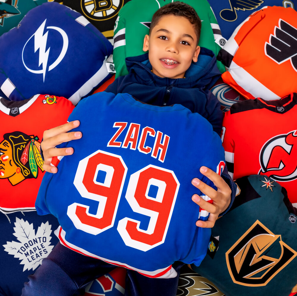
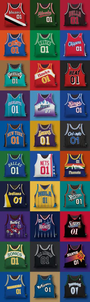
Big League Pillows
- Logo
- Packaging
- Website
- Social media
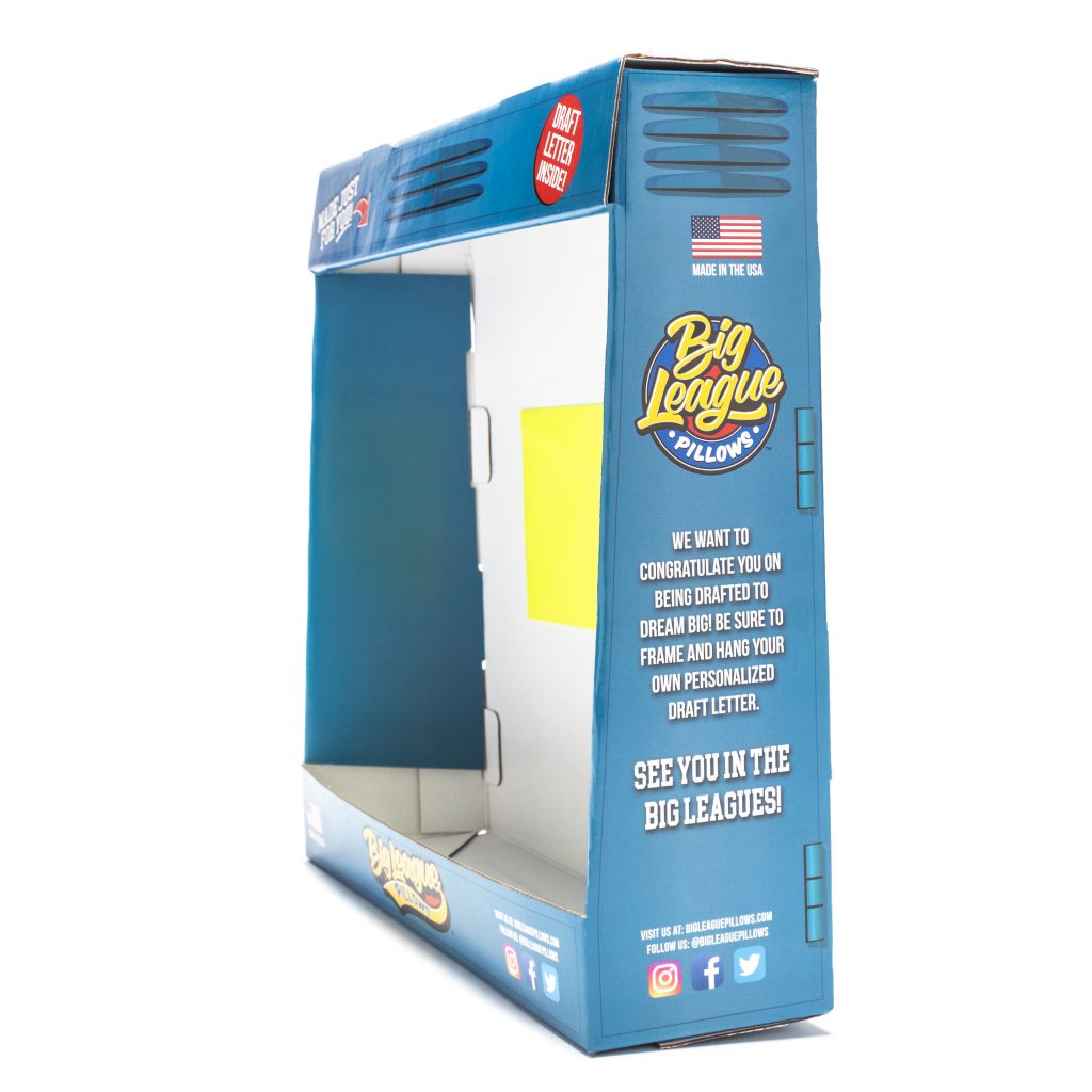
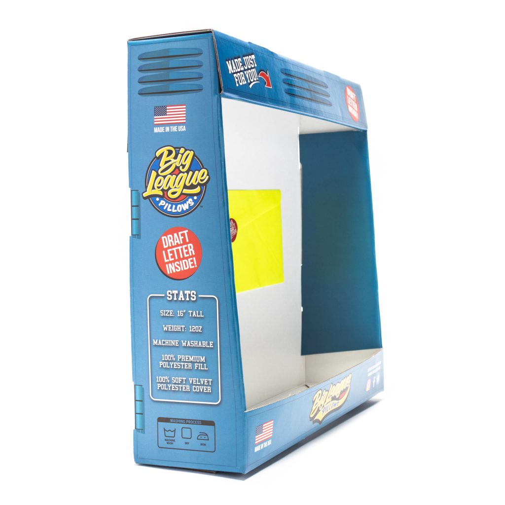
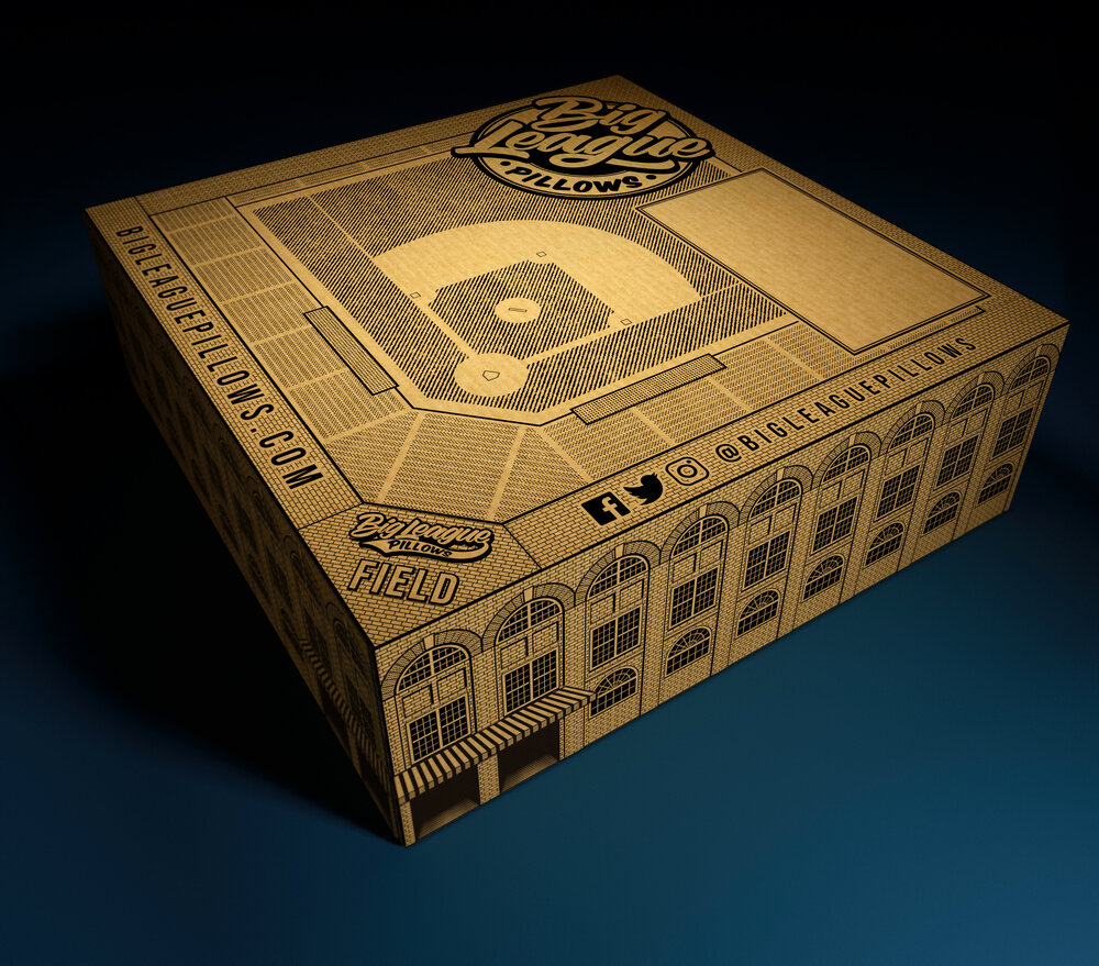
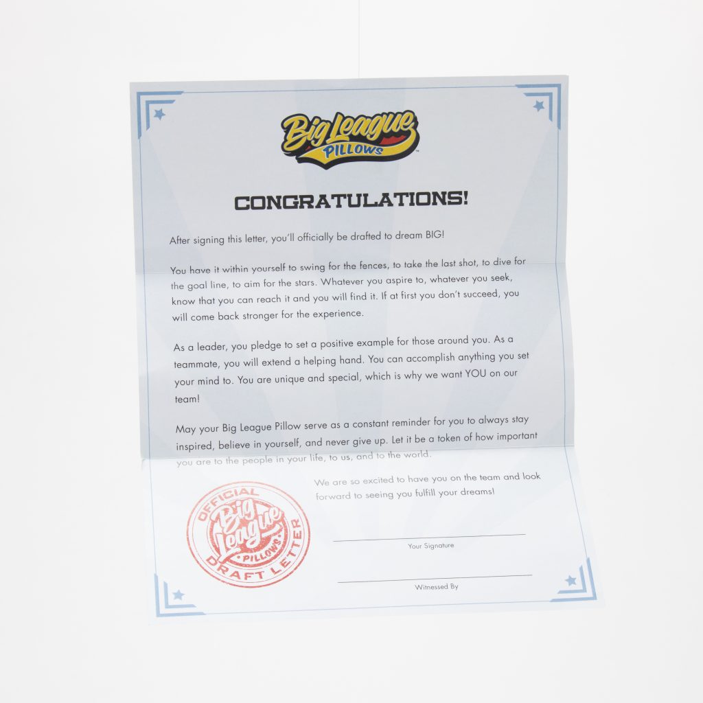
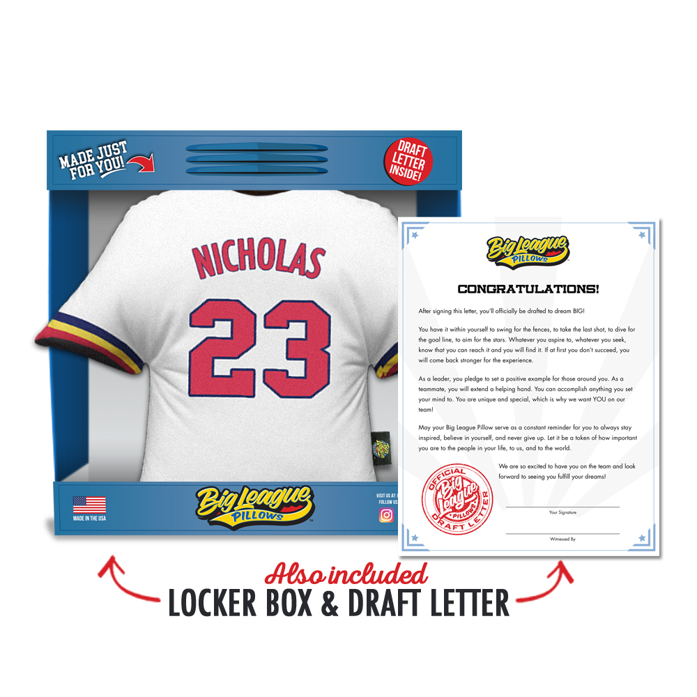
An 80s kid all grown-up had a dream that combined his love of sports, the desire for comfort and a wish to inspire…that vision became Big League Pillows. The product is a customized sports jersey pillow, however our mission was to establish a brand that delivered a memorable experience for the buyer. Clever packaging with a playful tone was a key element in making this brand feel truly special. Each pillow arrives in its very own locker box, with a motivational draft letter to further personalize the experience. We utilized primary colors and bubble font to pay homage to the 80s toys, which inspired the product, yet the brand still feels modern. Since the product is predominantly sold through ecommerce and we wanted the very first perception of the brand to begin when the box arrives at your door, we adorned the shipping box with an image of a stadium. With an emphasis on experience across all platforms, the website prompts the buyer to “build” their own jersey pillow by selecting their sport, team colors, city and featured name. The option to mix and match makes the ordering process fun. To keep the consistency of a relatable brand, instead of filling the social media accounts with formal pictures of models, we opted to showcase photos of real BLP recipients with their MVPs (most valuable pillows). You can picture your child watching their Saturday morning cartoons or your biggest sports fan rooting for the game all while snuggled up with a Big League Pillow. Posting submitted pictures gives the brand an accessible feeling…we are all playing for the same team. To join the Big Leagues, visit bigleaguepillows.com
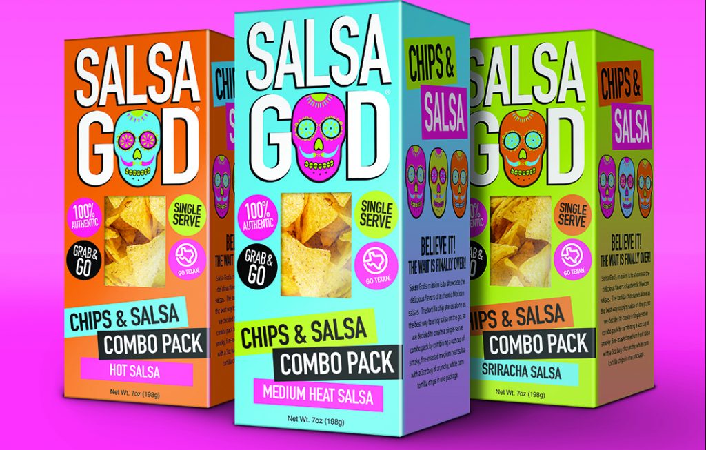
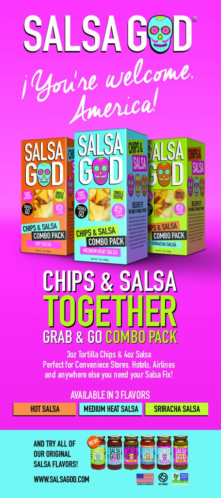
Salsa God
- Packaging
- Website
The Salsa God chips and salsa combo pack is on trend in the era of grab and go snacks. A festive color palette of blue and hot pink with lime green accents and Day-of-the-Dead inspired imagery give the packaging an authentic Mexican feel. Big, bold font and color blocking convey thoughts of a large party. Content presented in circles could rouse thoughts of balloons with rectangles below feeling like mini streamers. “Great packaging is absolutely essential in the CPG space. A consumer will, on average, spend about seven seconds looking at your product before deciding whether to pick it up and give it further consideration,” said Danny Mayans, Founder of Salsa God. “Colorful, eye-catching packaging/labels will grab the consumer’s attention and should lead to higher sales.” The peep window grants shoppers the opportunity to see the chips and feel confident they haven’t been broken into crumbs. The box includes prominent listings of ingredients and nutrition facts so buyers know exactly what they are consuming. By accentuating the purity of the ingredients and the simplicity of the recipe, the attention is directed to flavor.
Keeping the emphasis on taste, the website’s main features are easy-to-locate ingredients, nutrition facts and recipes accented with sharp product photography. The website is informative and optimized for a user-friendly mobile experience. The packaging and website had to deliver a strong punch to mirror the powerful flavors this salsa has become recognized for in grocery chains and restaurants nationwide. Salsa God is sold at Whole Food Market, Safeway, and other local retailers. Visit salsagod.com to find one near you today.
We are grocery shoppers who will try a new product thanks to innovative packaging. Knowing the time and energy dedicated to each choice of color, material and font, we’ll take a chance. Our team looks to you to develop an outstanding product. Turn to us to wow your future consumers with cutting-edge packaging, so your product lands in their cart. Visit doubledown.digital to get started today!